Bar Chart in less than 10 Sentences
- Introduction
- Overall
- Body paragraphs
- Comparisons – special focus
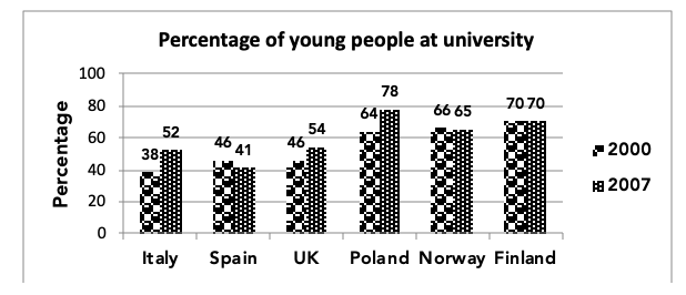
The chart below shows the percentage of young people at universities in six countries, in 2000 and 2007. Summarize the information by selecting and reporting the main features and make comparisons where relevant.
Writing the Introduction – Sentence 1
Step 1: Focus on the question, the diagram and understand the meaning behind.
Step 2: Speak out one line with the data.
In this case – 38% of the Italian youth were enrolled in universities in 2000.
Step 3: Write the introduction (Try paraphrasing if possible, if can’t, don’t overthink and just make minor changes)
Sentence 1: The bar graph illustrates the proportion of youth from six countries studying in universities in 2000 and 2007.
Writing the overall – 2 Sentences – Sentence 2 and 3
Overall – we will write two sentences.
Sentence 2 (Sentence 1 of overall):
Step 1: Focus on the maximum in each year individually. Meaning, first look at the first bar in each country (Ignore the second). Then, look at the second bar in each country (Ignore the first)
Step 2: Now combine the year 1 and year 2 maximums and write your first sentence of
overall. (Remember use contrast like ‘while‘ because in both years country is different)
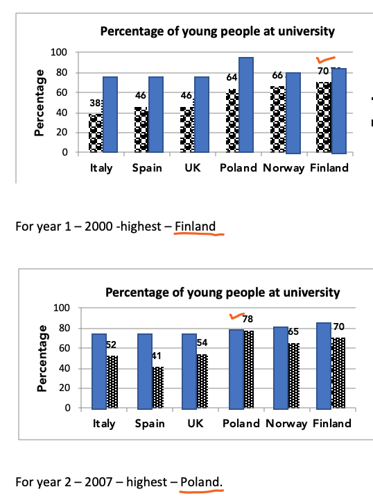
Overall, it is clear that among the given countries, Finland had the maximum proportion
of youth enrolled in universities in the 2000, while in 2007, the maximum percentage
was from Poland. (Sentence 2)
Sentence 3 (Sentence 2 of overall):
Step 1: Mark the trends for each country. (Increase or Decrease)
Step 2: Make a sentence which represents the trend for every country. ( Please notice how the word ‘except’ has been used to bring out the comparison)
There was change in the proportion of youth enrolled studying in universities in all the countries except Finland. (Sentence 3)
Till now 3 Sentences:
The bar graph illustrates the proportion of youth from six countries studying in universities in 2000 and 2007(Sentence 1).
Overall, it is clear that among the given countries, Finland had the maximum proportion of youth enrolled in universities in the 2000, while in 2007, the maximum percentage was from Poland (Sentence 2). There was change in the proportion of youth enrolled studying in universities in all the countries except Finland (Sentence 3).
Sentence 1, 2 and 3: Done
Writing the Body Paragraphs
Divide the body paragraphs based on trends.
Body Paragraph 1 (Sentences 4 to 6):
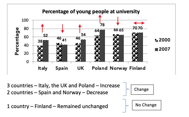
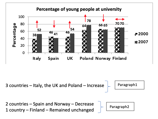
3 countries – Italy, the UK and Poland – Increase
Step 1: Sentence 4: Mention the trend of the body paragraph – increase
Step 2: Sentence 5 and 6: Give the data for the 3 countries.
Body Para 1: In Italy, UK and Poland the percentage of youth enrolled in universities increased over time. (Sentence 4 – Trend) 38% of Italian youth and 64% of Polish youth studied at universities in 2000 and both these countries saw a rise of 14% in the next seven years. (Sentence 5 – Italy and Poland) Similarly, in the UK the percentage of youth enrolled in universities increased from 46% to 54%. (Sentence 6 – the UK)
Sentence 4,5,6 – Done.
Body Paragraph 2 (Sentences 7 to 9):
2 countries – Spain and Norway – Decrease
1 country – Finland – Remained unchanged
Step 1: Sentence 7: Mention the trend – decrease
Step 2: Sentence 8: Give the data of the countries which faced a decline.
Step 3: Sentence 9: Mention the country where it remained stable.
Note: Use connectors when moving on to new trend.
Body Para 2: By contrast, Spain and Norway witnessed a small decline in the proportion of youth enrolled in universities. (Sentence 7 – Trend) In Spain, the percentage of youth enrolled in universities fell from 46% to 41 and in Norway, the proportion fell from 66% to 65%. (Sentence 8 – Spain and Italy). Finally, the percentage of Finnish youth in universities remained the same at 70%. (Sentence 9 – Trend and data)
Sentence 7,8,9 – Done
The complete graph
The bar graph illustrates the proportion of youth from six countries studying in
universities in 2000 and 2007.
Overall, it is clear that among the given countries, Finland had the maximum proportion
of youth enrolled in universities in the 2000, while in 2007, the maximum percentage
was from Poland. There was change in the proportion of youth enrolled studying in
universities in all the countries except Finland.
In Italy, UK and Poland the percentage of youth enrolled in universities increased over
time. 38% of Italian youth and 64% of Polish youth studied at universities in 2000 and
both these countries saw a rise of 14% in the next seven years. Similarly, in the UK the
percentage of youth enrolled in universities increased from 46% to 54%.
By contrast, Spain and Norway witnessed a small decline in the proportion of youth
enrolled in universities. In Spain, the percentage of youth enrolled in universities fell
from 46% to 41 and in Norway, the proportion fell from 66% to 65%. Finally, the
percentage of Finnish youth in universities remained the same at 70%.
Checkout more examples of Bar Graphs here
More Graph Types

Good brilliant
Please writing share
Hi my name is shahnoza l am from uzbekistan.can u advise me about speaking what do l do improving speaking skill?
Amazing tips
And useful content
Hello sir,
Where is process graph explanation in less than 10 sentence. Please reply 🙂
Hey mam, after referring your book of 160 graphs, it seems that in every question the overall portion is written at the end of the solution and in your teaching video you suggests to write it after paraphrasing paragraph. so it is been a dilemma for me to pick the most appropriate one. Waiting for your comment.
Tanay, you are referring to a pdf written 3 years ago. Please refer to the latest material.
expected questions for October 24th writing task 1 and task 2 can u send in email.