Pie Chart in less than 10 Sentences
- Introduction
- Overall
- Body paragraphs
- Comparisons – special focus
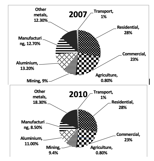
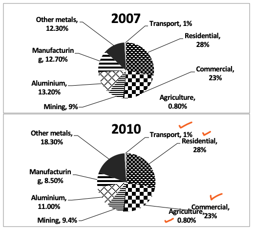
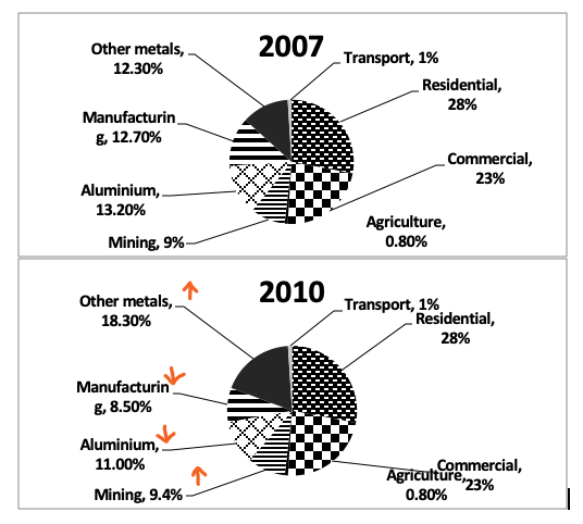
The chart below shows the electricity consumption in different sectors of Eastern Europe in 2007 and 2010. Summarise the information by selecting and reporting the main features and make comparisons where relevant.
Writing the Introduction – Sentence 1
Step 1: Read the question and try to understand what the data represents.
Note: The data is always in percentages in the pie chart, so in a way you are determining what the percentages represent.
Step 2: Write one sentence or speak out one sentence with the data.
In this case: In 2007, 9% of the electricity was consumed in the mining sector.
Step 3: Use – Question, Data Understanding and Information from the diagram.
And write your introduction
Sentence1: The pie charts illustrate the proportion of electricity consumed (data understanding) in eight(diagram) different sectors in Eastern Europe(question) in 2007 and 2010.
Writing the overall – 2 Sentences – Sentence 2 and 3
Overall – we will write two sentences.
Sentence 2 (Sentence 1 of overall):
Step 1: Focus on the maximum(highest) in each pie chart.
Step 2: If it’s the same thing – use ‘and’, If not use ‘comparison words like while’ to write.
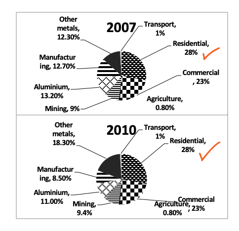
In this case in both the years, it is residential sectors.
2007 – Residential, 2010 – Residential
So, in this case we write:
Overall, it can be seen that the maximum electricity was used in the residential sector in both the years.
Let’s imagine, if in 2007 – Residential, but in 2010 Commercial.
The maximum energy was consumed in the residential sector in 2007, while in 2010, the maximum electricity was used in the commercial sector.
Note: Writing years in overall is ok, writing values for sectors is not ok
Sentence 3 (Sentence 2 of overall):
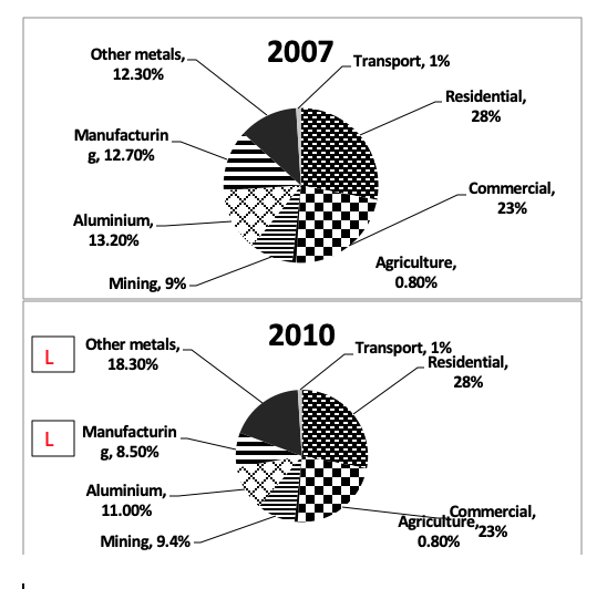
Step 1: Note down the degree of change ( see the difference in values between the two years in each sector)
– With Less than 2-3 % considered small.
– More than 4-5% – considered large. (Mark with L on question paper)
Note: Don’t skip any sector
Step 2: Express this in words
None of the sectors except other metals and manufacturing saw a major (considerable/substantial) change in electricity consumption over the three years.
Till now 3 Sentences:
The pie chart illustrates proportion of electricity consumed in eight different sectors in Eastern Europe in 2007 and 2010.(Sentence 1)
Overall, it can be seen that the maximum electricity was used in the residential sector in both the years. Also, none of the sectors except other metals and manufacturing saw a considerable change in electricity consumption over the three years. (Sentence 2 and 3)
Sentence 1, 2 and 3: Done
Writing the Body Paragraphs
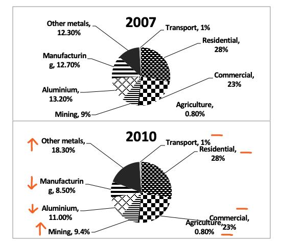
Step 1: Note the trend for each sector and mark it
Increase – 2 Sectors Other metals and Mining
Decrease – 2 Sectors Aluminium and Manufacturing
Remained Unchanged – 4 sectors: Transport, Residential, Commercial, Agriculture.
Step 2: Divide in two body paragraphs – On the basis on trends.
Body Para 1: 4 sectors which remained unchanged, along with data. (Three sentences)
Body Para 2: 2 sectors (Increase) + 2 sectors (Decrease) along with data. (Three sentences)
Step 3: When you change from 1 trend to another – use a contrast connector or represent a contrast connector to use a huge difference in data.
Body Paragraph 1 (Sentences 4 to 6):
4 sectors which remained unchanged, along with data. (Three sentences)
Sentence 4: There are 4 sectors unchanged.
Sentence 5: Data for 2 of these sectors.
Sentence 6: Data for the remaining 2 sectors
Body Para 1: In detail, there was no change in the proportion of electricity consumption in residential, commercial, transport and agricultural sectors between 2007 and 2010. In both these years, residential and commercial sector together accounted for slightly more than half of total electricity usage, with individual figures at 28% and 23% respectively. In contrast, a mere 1.8% of electricity was consumed in agricultural and transport sector combined. (Sentence 4, 5 and 6)
In contrast – show the huge difference in figures.
Sentence 4,5,6 – Done.
Body Paragraph 2 (Sentences 7 to 9):
Sentence 7: Mention the two sectors which saw an increase.
Sentence 8: Give their data.
Sentence 9: Mention the two sectors which saw a decrease, along with their data.
Body Para 2: Electricity consumption in other metals and mining saw an increase. In other metals, the proportion rose by 6% over the three years to reach 18.3% in 2010, while in mining it was 9% in 2007 and it stood at 9.4% in 2010. By contrast, electricity consumption in manufacturing and aluminium stood at around 12.7% and 13.2% respectively in 2007 and over the three years there was a fall of 4% and 2% respectively. (Sentence 7, 8, 9)
While used – Show the difference in data.
By contrast – Show the change in trend from increase to decrease.
Sentence 7,8,9 – Done
The complete graph
The pie chart illustrates proportion of electricity consumed in eight different sectors in Eastern Europe in 2007 and 2010.
Overall, it can be seen that the maximum electricity was used in the residential sector in both the years. Also, none of the sectors except other metals and manufacturing saw a considerable change in electricity consumption over the three years.
In detail, there was no change in the proportion of electricity consumption in residential, commercial, transport and agricultural sectors between 2007 and 2010. In both these years, residential and commercial sector together accounted for slightly more than half of total electricity usage, with individual figures at 28% and 23% respectively. In contrast, a mere 1.8% of electricity was consumed in agricultural and transport sector combined.
Electricity consumption in other metals and mining saw an increase. In other metals, the proportion rose by 6% over the three years to reach 18.3% in 2010, while in mining it was 9% in 2007 and it stood at 9.4% in 2010. By contrast, electricity consumption in manufacturing and aluminium stood at around 12.5% and 13.5% respectively in 2007 and over the three years there was a fall of 4% and 2% respectively.
Check out more examples of Pie Charts here
More Graph Types
Good website
So helpful
I am so delighted to have stumbled on this sight a week to my test.. I feel very confident now
Big thanks to this team
Hey Mam, your teaching is like a candle in a dark room
Mam, your methods are so good and the way you explain makes it super easy. Each time, I start any task, I just listen to your videos again and again. Thanks for your great efforts!